Menu

Share

Neon

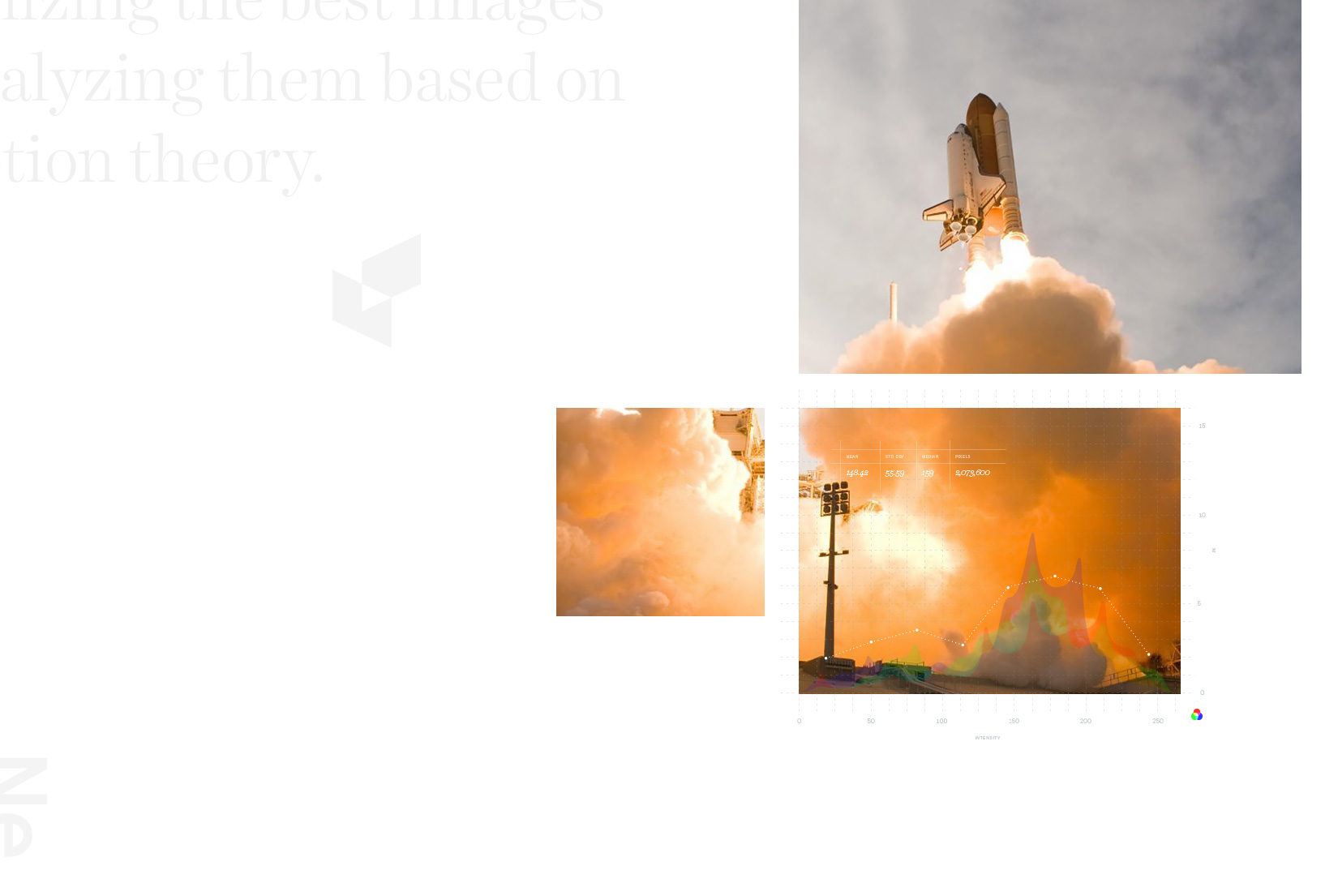
Sending The Best Images Forward

Brand Systems + Identity + Photography + Print + UX & UI Design

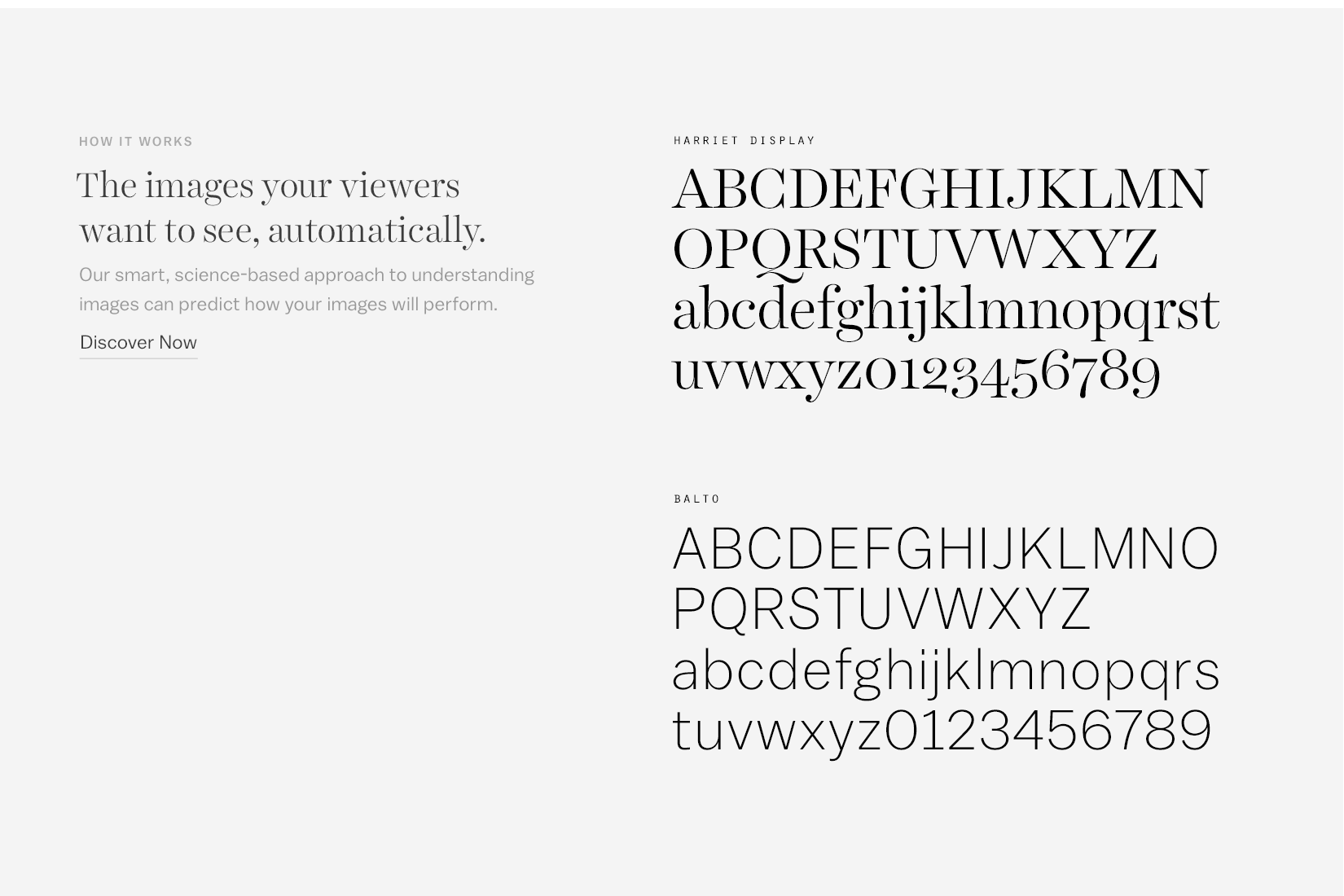
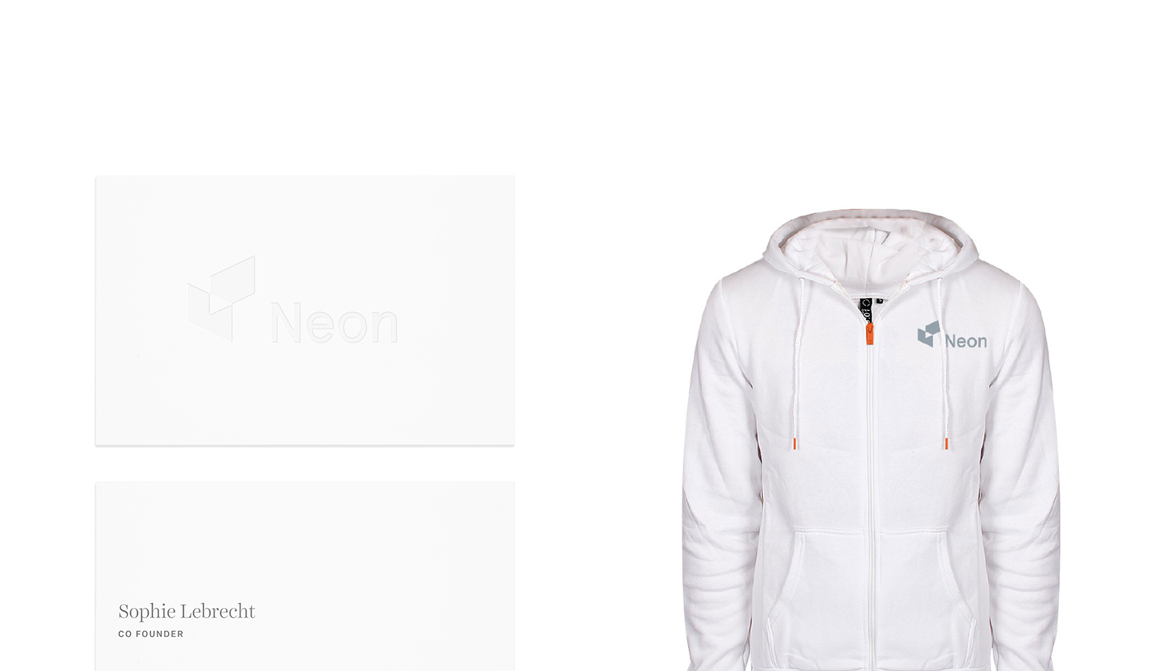
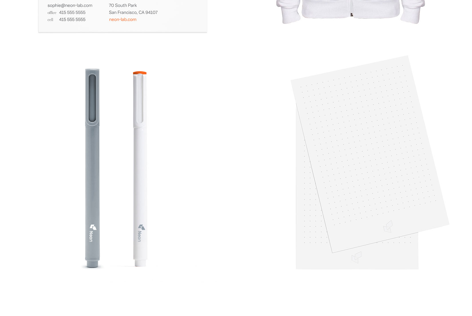
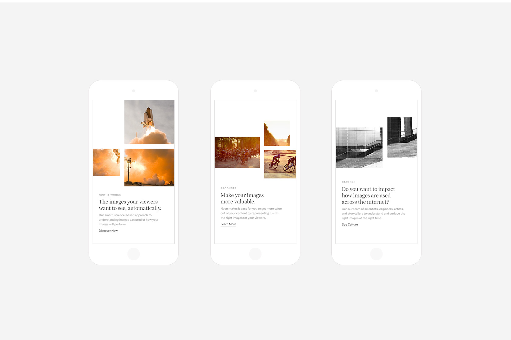
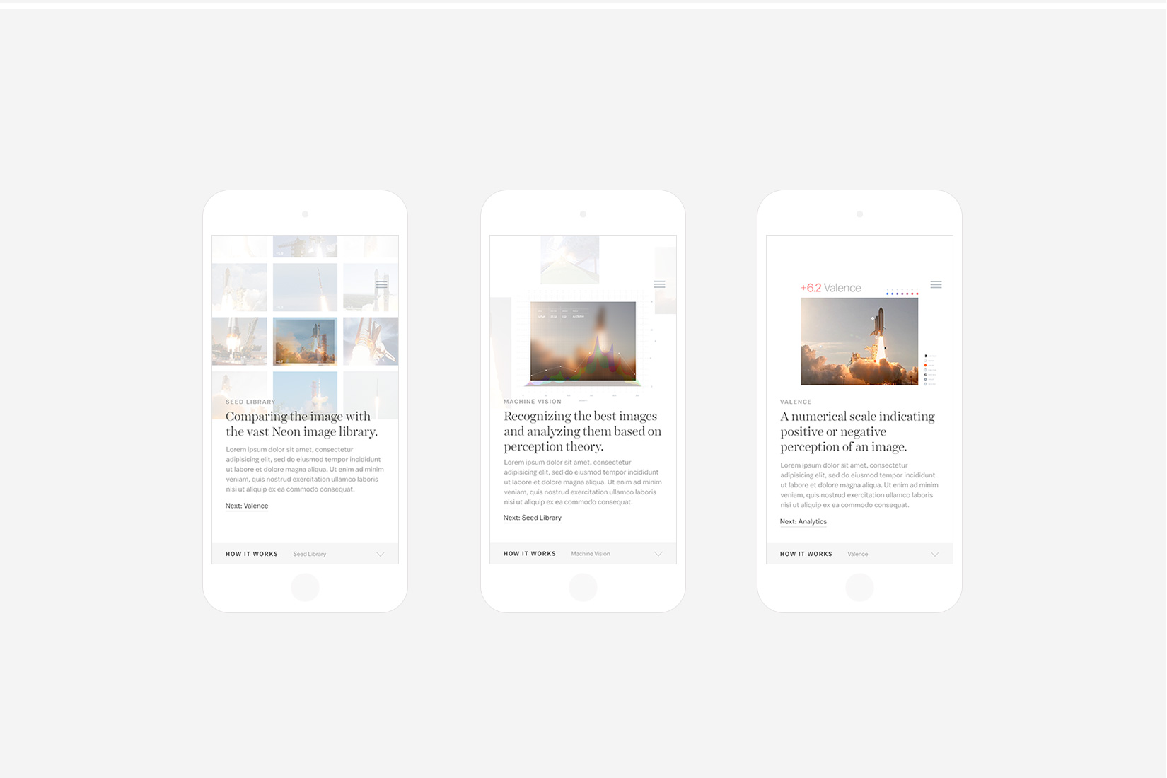
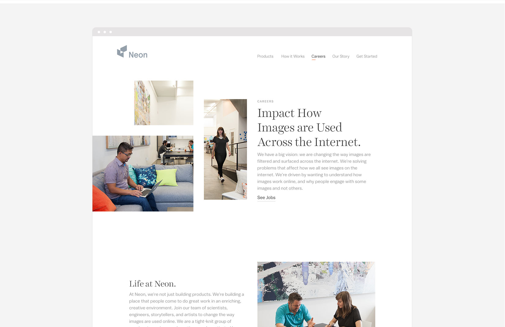
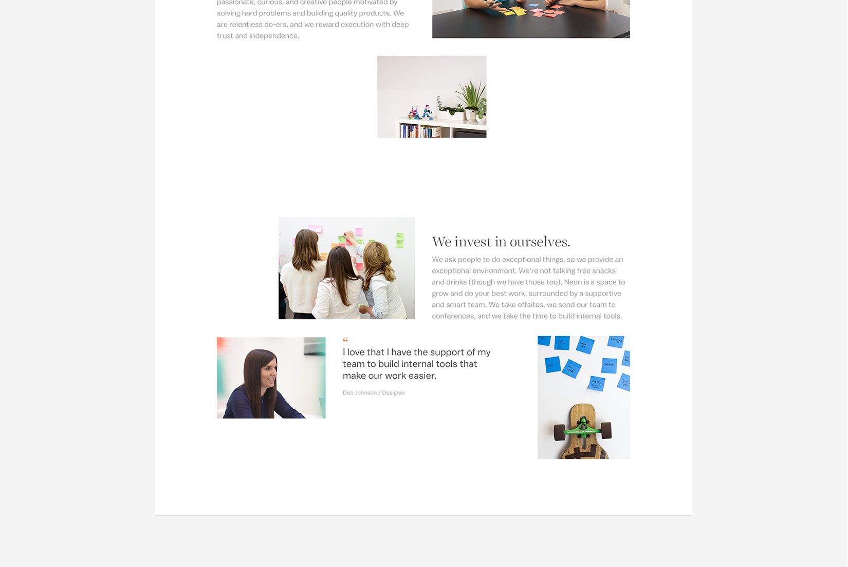
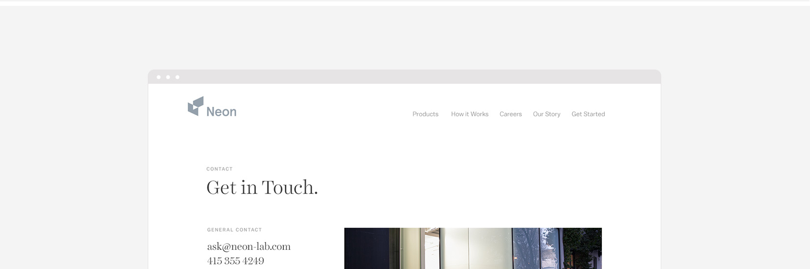
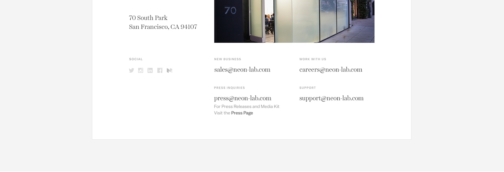
In 2015 we helped define the brand for Neon, a technology company that has the world’s only neuroscience-based machine learning system for predicting which images users will click on. Neon takes the idea of image curation to an unprecedented new level, and it was important that this identity communicate the sophistication of their advanced technology. We worked closely with their team to visualize their brand communications from their core identity materials to their website. Their site has changed dramatically since launch, so we've done our best to immortalize it here.

The Neon Lens

We wanted the mark to represent the function of what Neon’s software does, which is essentially a highly advanced filter that scans images & video for their neurologically attractive attributes. Images deemed most effective, will pass through this portal to be deployed on a client’s site. The mark captures this function in an abstract way, with two planes passing through each other creating a subtle forward arrow (or play button) at its core. This concept of “portal” is something we employed throughout the brand.

During the brand discovery process, MM actively listened. They translated our often abstract ideas into a mark that truly represents us. The power of our mark carries through the website and other brand touchpoints down to the smallest details.
Sophie Lebrecht
Chief Science Officer

Extending the Brand Metaphor Into Digital

The website was the main touchpoint of the Neon brand, and we wanted most importantly to communicate their product offering in the clearest, most compelling way possible. As a secondary goal, we wanted to make sure the brand concept of “portal” was translated in some way digitally on the site. Our development team treated the animation of imagery as if it were being viewed through a window on top of the photography.

How It Works

One of the hardest parts of this job, was describing how their product works. There were so many steps and processes to consider, and it was important that our walk-through was both accurate and understandable without dumbing down what their algorithm does.

We Are Not A Startup

The origin story of Neon’s product spans over 15 years all the way back to the founders academic careers. It was important to Neon that we tell not only their story but also the story of the Image, and where Neon fits into that history. We designed a timeline experience that walks the user through this narrative.