The Concept of FREEDOM
Brand Systems + Environments + Packaging + Typography + UX & UI Design
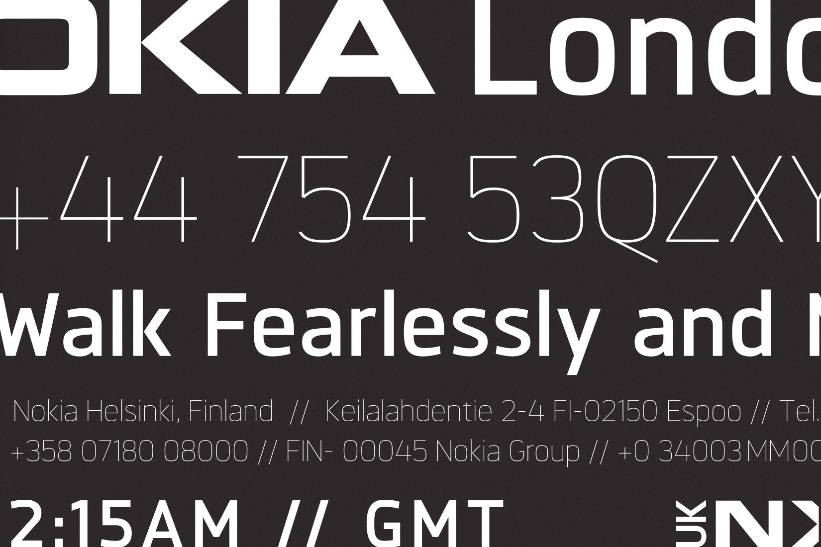
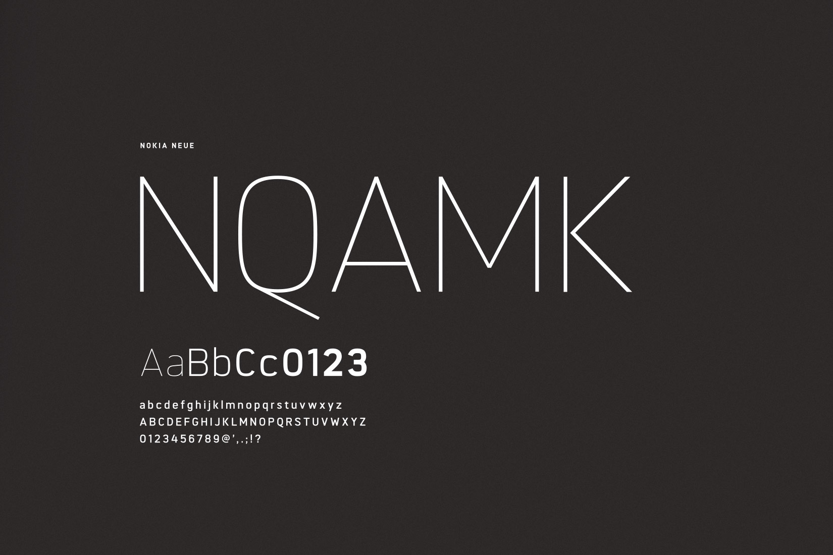
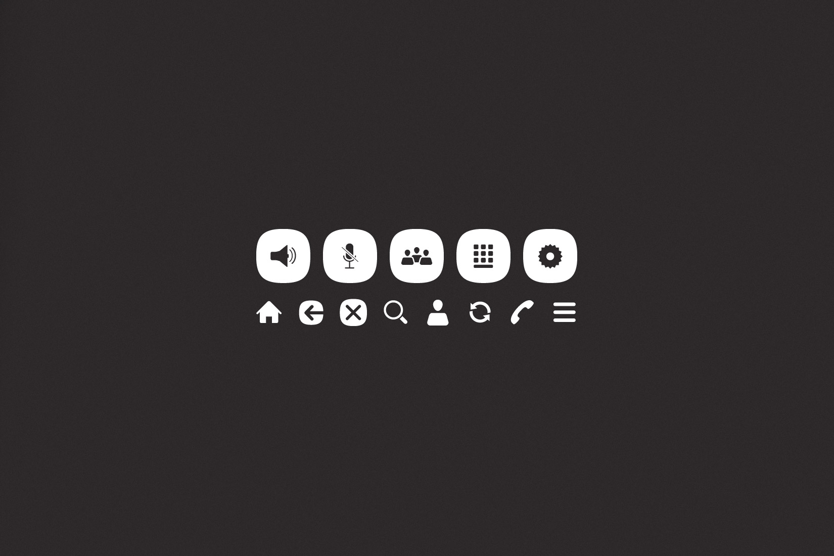
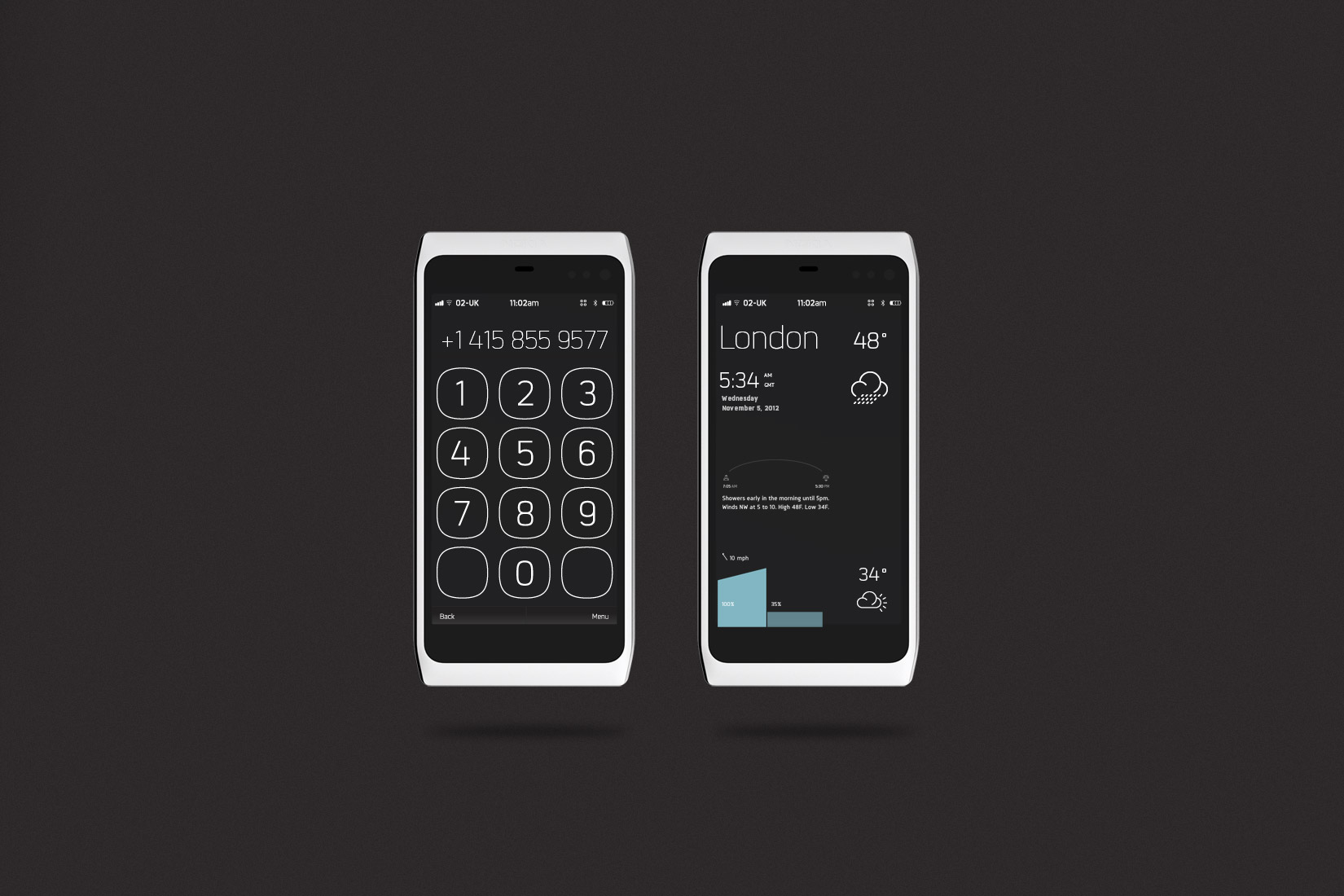
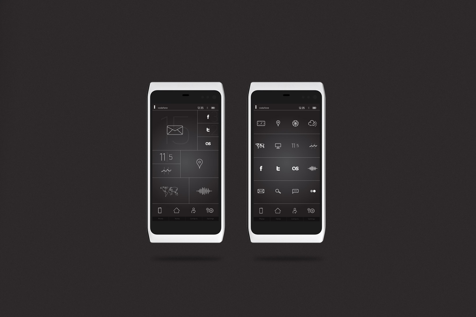
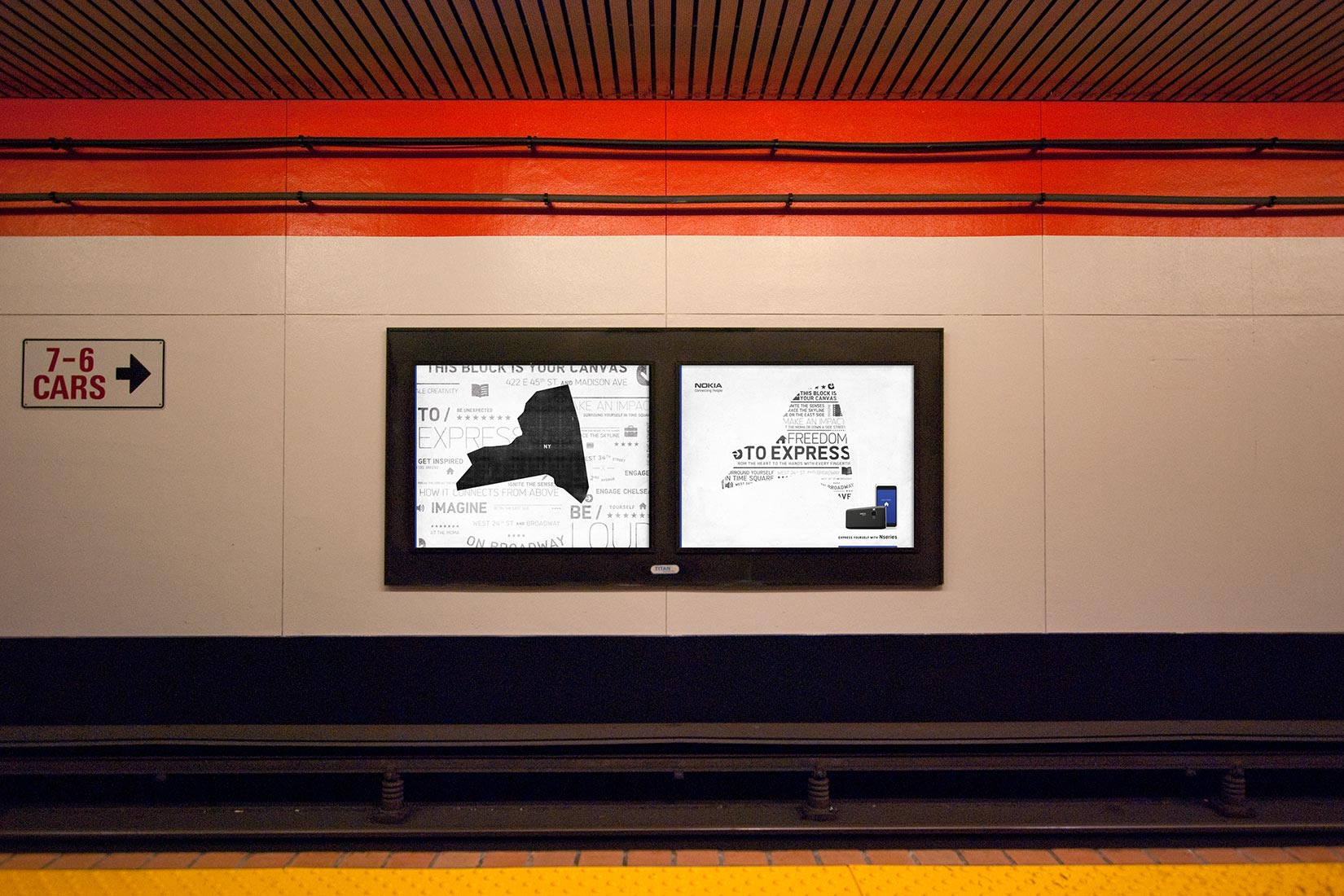
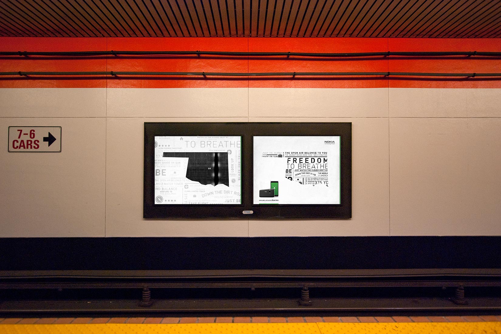
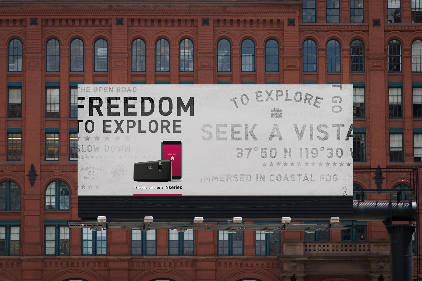
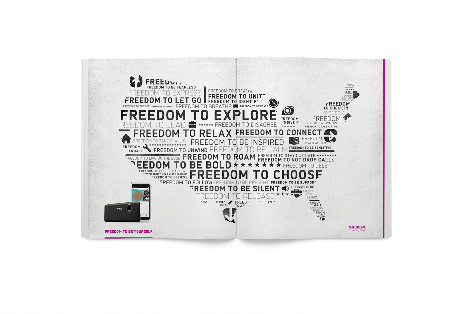
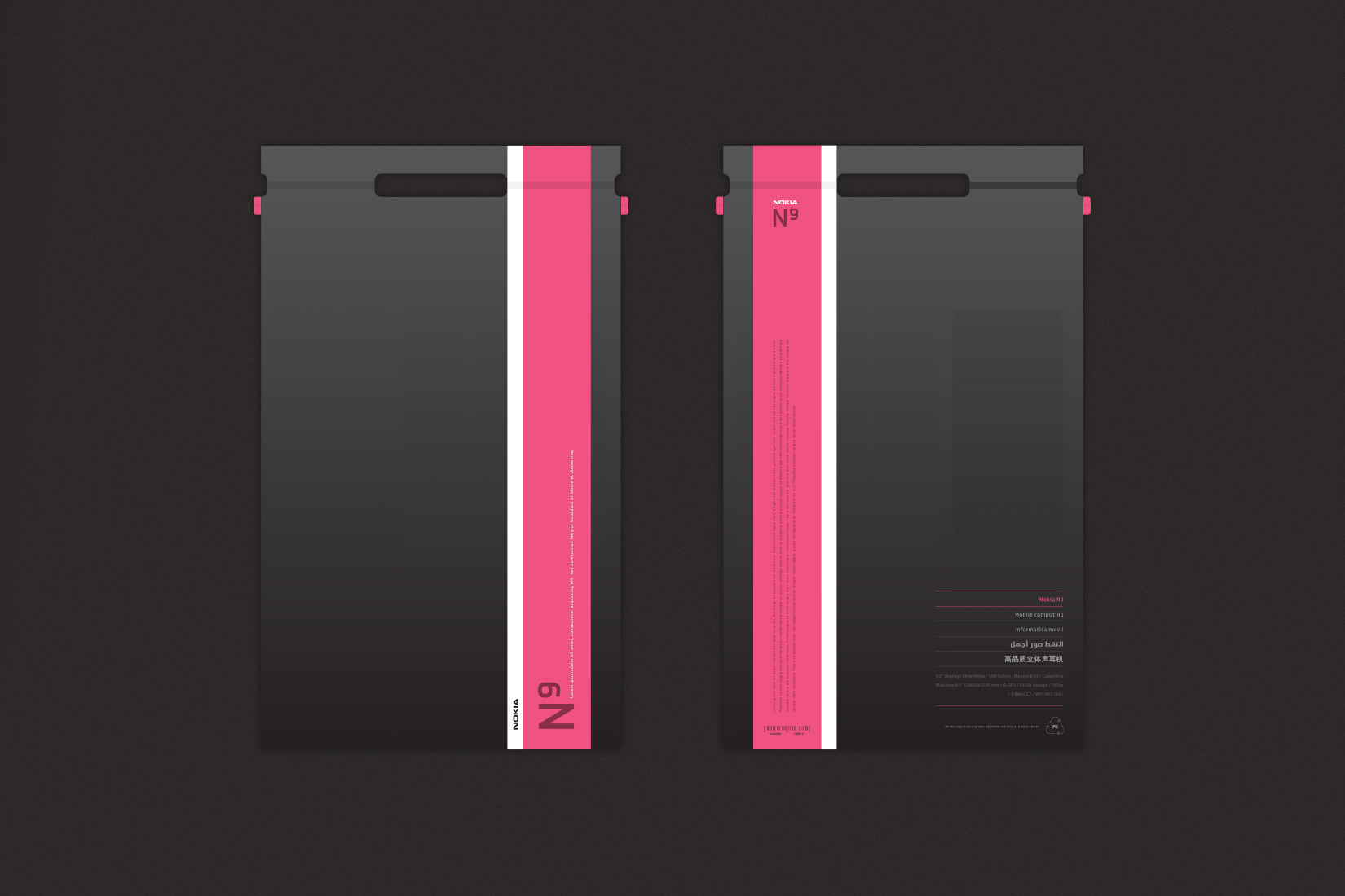
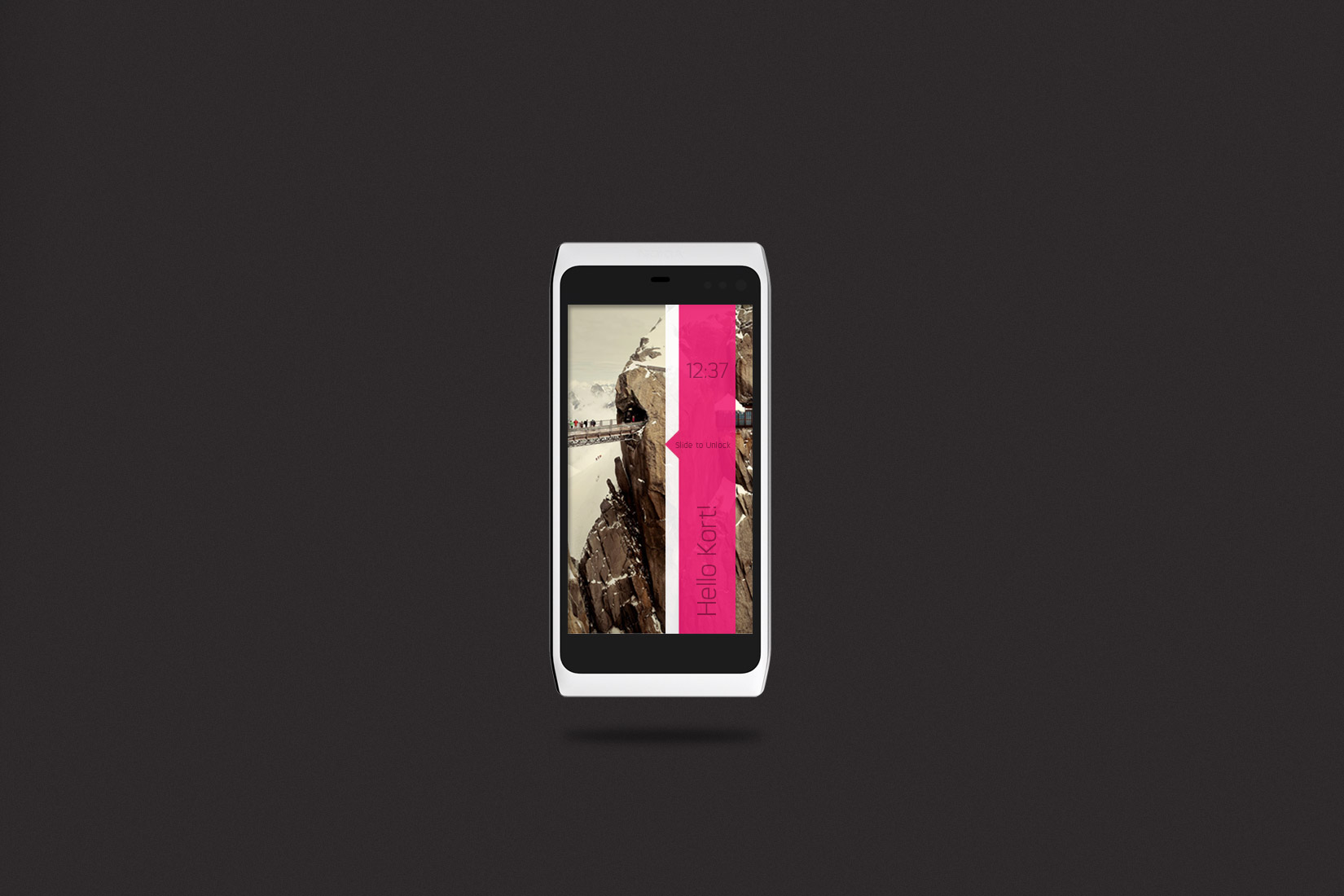
We worked with Nokia on repositioning their brand in the US marketplace. This led us to crafting Nokia Neue, a much needed new typographic family and replacement to Erik Spiekermann's Nokia Sans. We wanted the new typeface to become the voice of the campaign and to be a driving force of inspiration and form for the new User Interface.
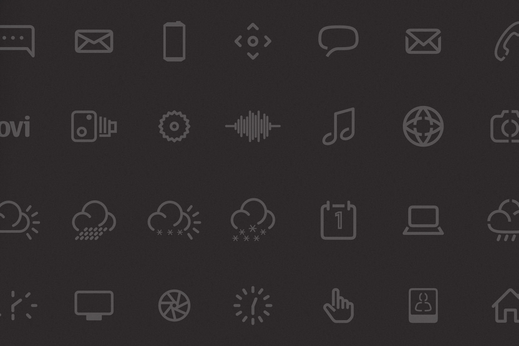
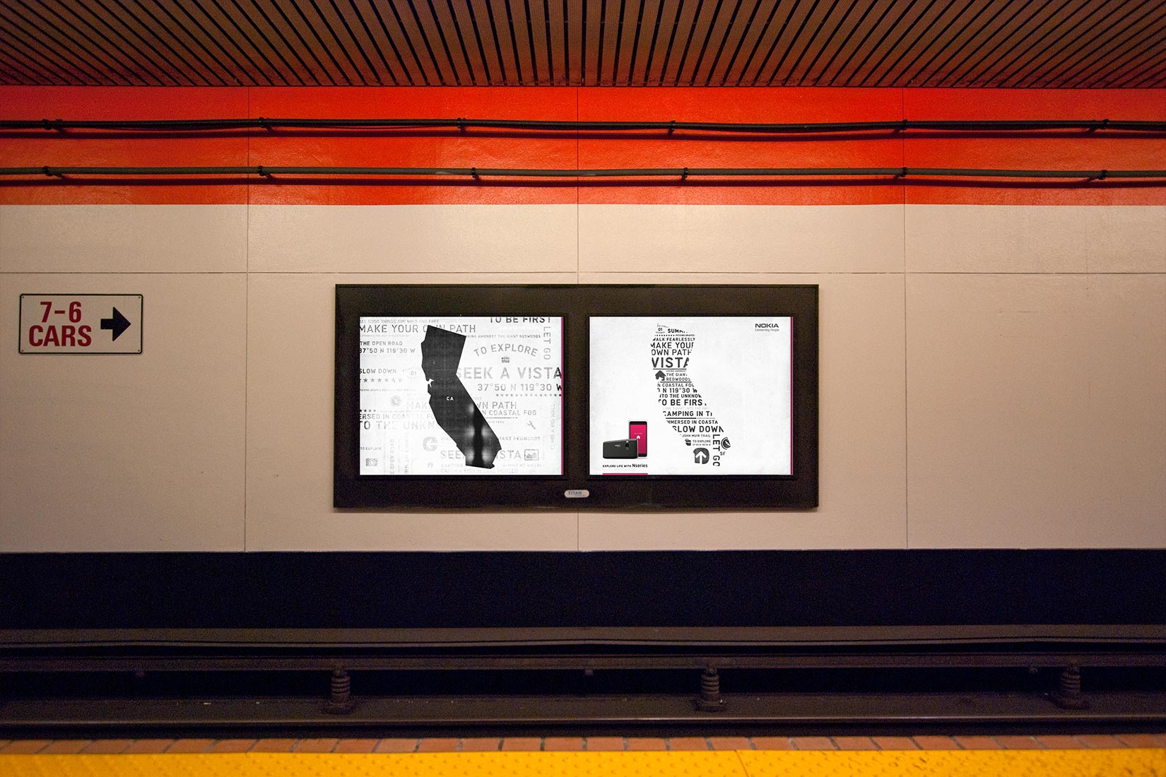
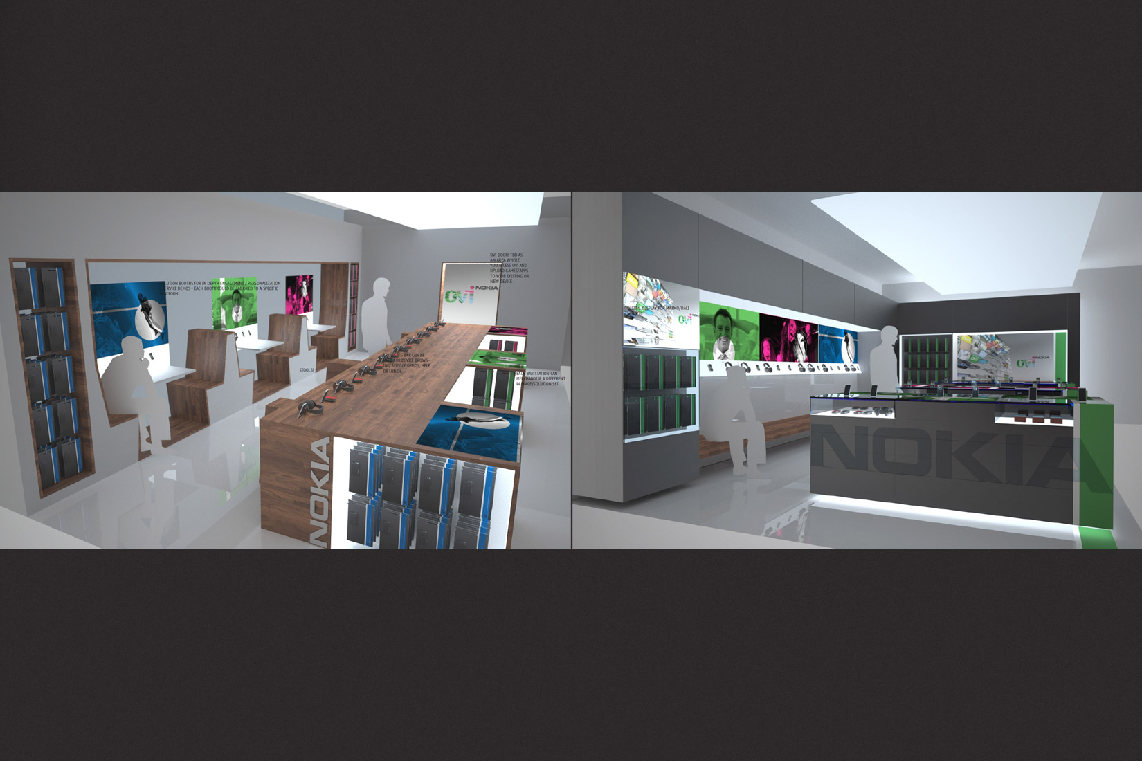
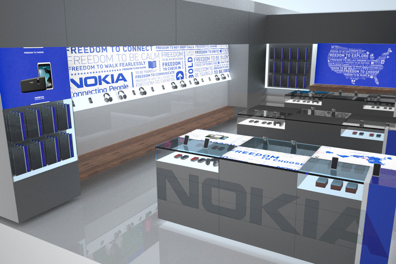
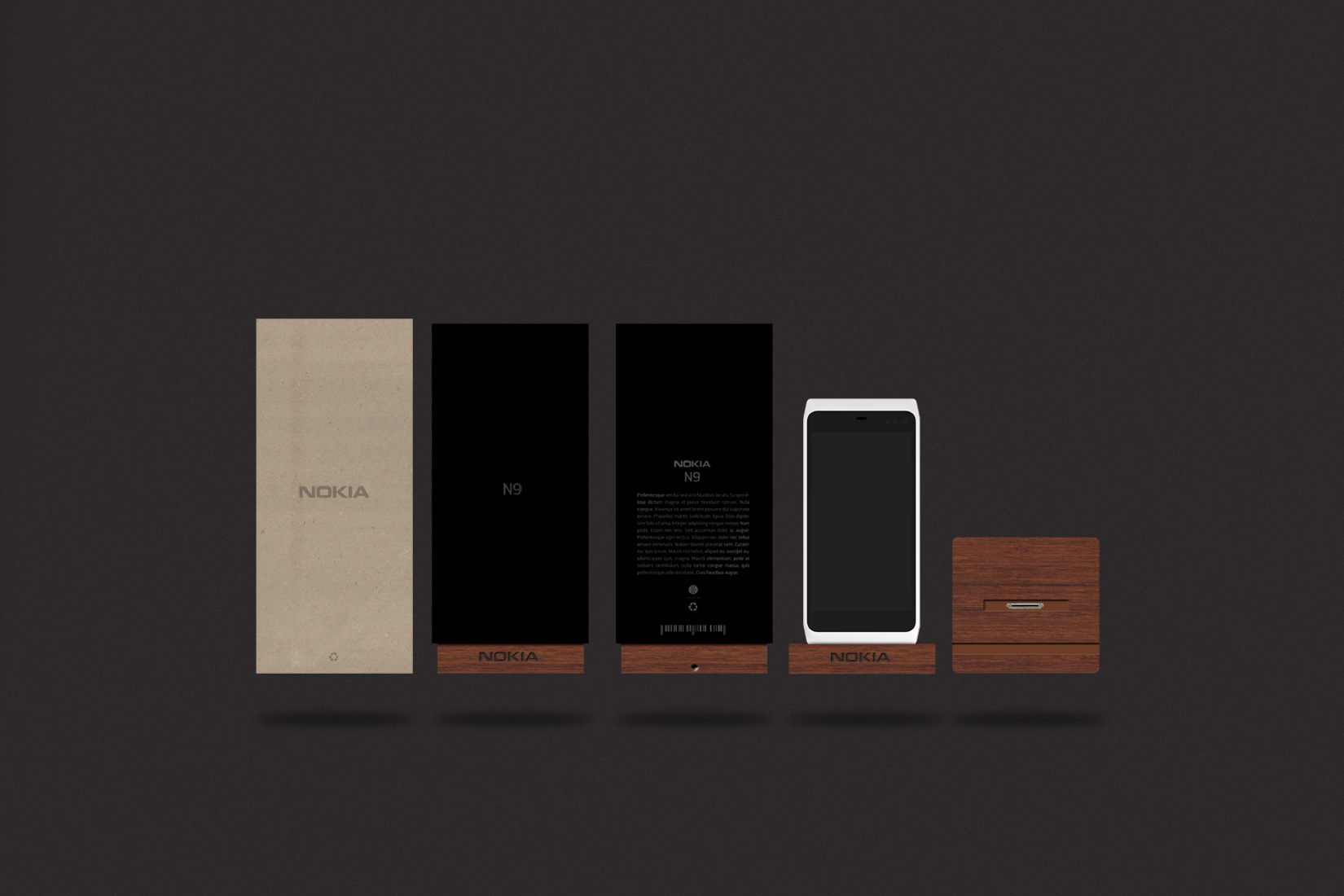
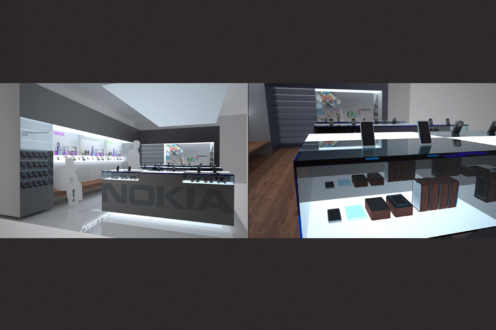
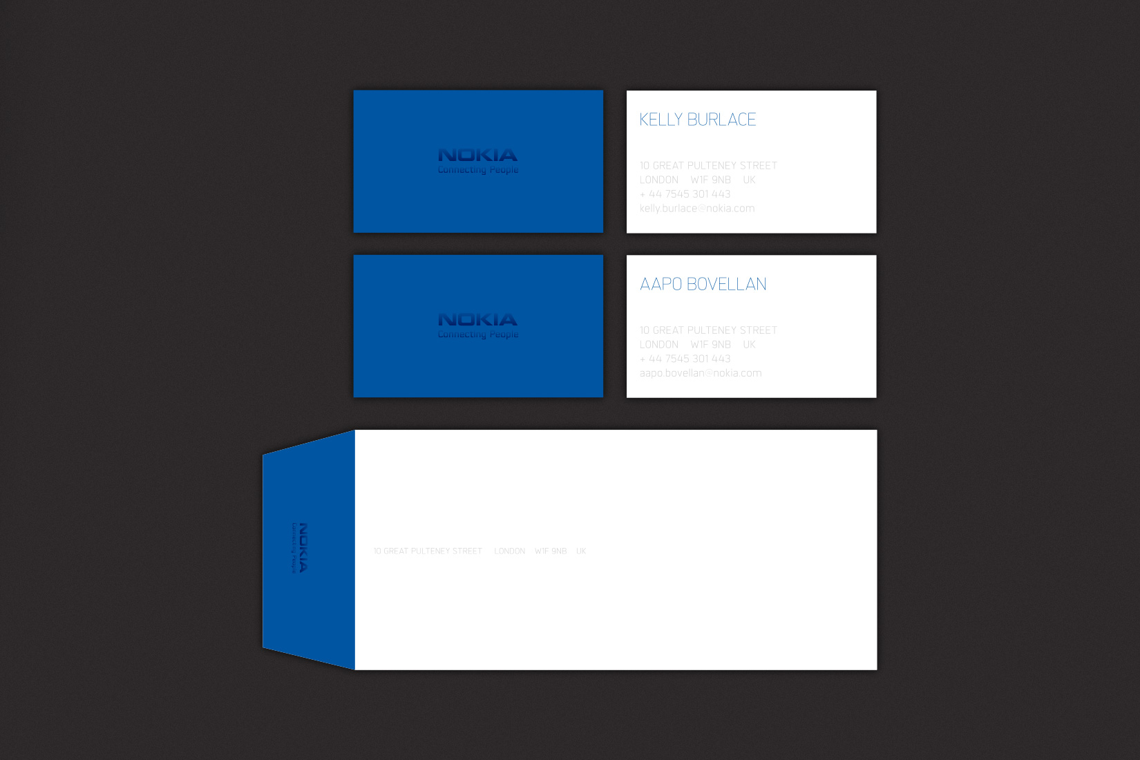
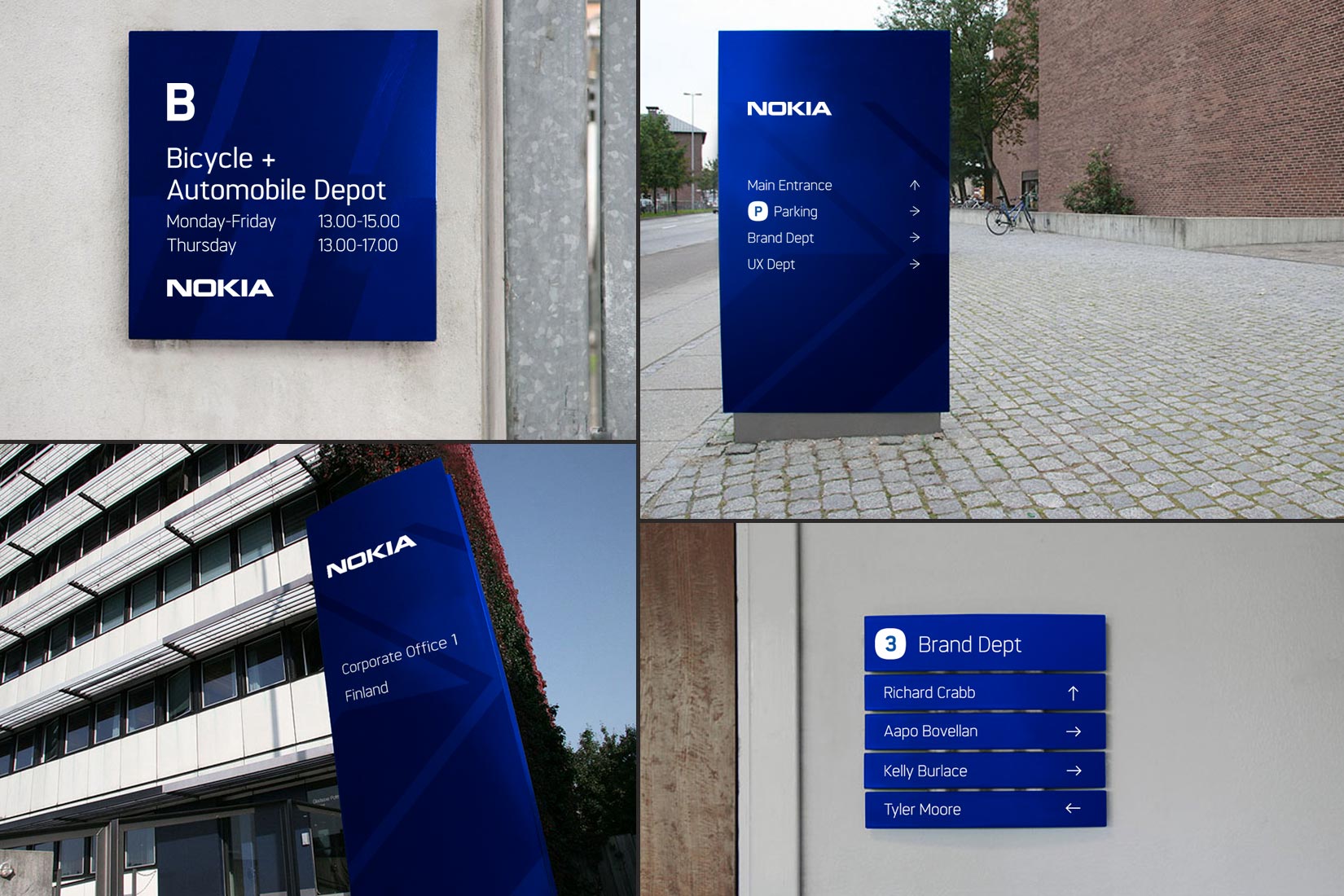
The campaign we designed focused on the concept of FREEDOM; the freedom to breathe, to roam, to express and to slow down. Furthermore, we wanted this to be a national campaign that allowed for each state to take on its own character and messaging. In the end of the design sprint we had crafted a new typeface, campaign concept, packaging and retail concepts, UI design, corporate collateral and way-finding signage.
Aapo Bovellan
Director, Brand Offering
“Working with multiple small and large design and advertising agencies globally, I consider MM’s craftmanship and skills in graphic design some of the best I have worked with and can gladly recommend them for branding and graphic design projects.”